Tik Tok Intervention
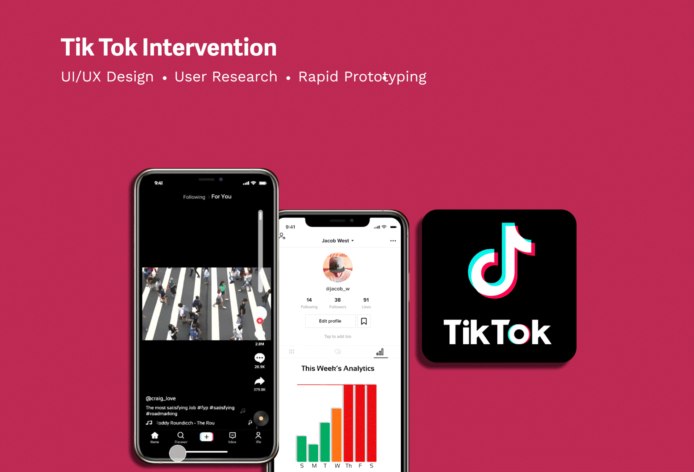


Project Overview

Problem Statement
Through further discussion, we decided that one of the main causes of addiction to Tik Tok, was the ability to endlessly scroll. We decided that this would be the main focus of our primary research and eventually, our final design. Our major questions we sought to now answer were:
How might we make scrolling on Tik Tok less addictive?
How might we reduce the amount of screen time spent on the app?
Solution
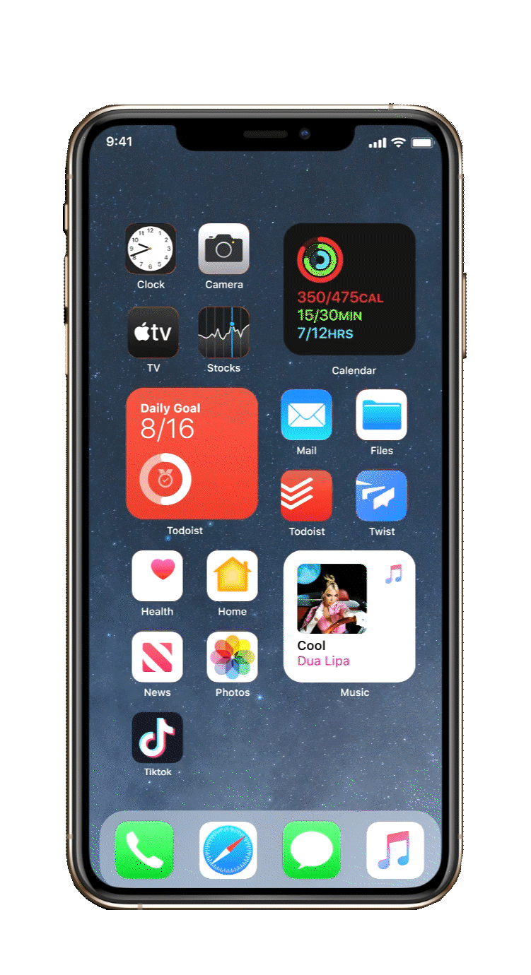
Following analysis of our research and further use of brainstorming methods; we designed an intervention that would end the user’s timeline after 1 hour, allowing them to come back only after 2 hours. This included a pop up warning 15 minutes before the time-line ends, and another whole screen pop up that locks the user out after the time line has ended. We also designed a Stats page; showing the user their weekly screen time levels, to create awareness.


To better understand Addiction to Social media and how it affects users, we made an Ecosystem Collection Map based on our primary research. This chart highlights the assumptions and knowledge gaps, which are used to help think about which target areas would be focused on during research.
Some More Research!

Using the target areas that our team identified in the Ecosystem Collection Map, as a team we collected Insights about different topics related to the insights from our primary research and interviews we conducted with our target audience.


Next up, we used Affinity Diagramming to synthesize all our findings from the interviews we conducted and the research we did; in order to better understand their relations to one another, how we could ideate solutions, and what we would focus on.
During Synthesis, we identified similarities in high social media usage, the highest amounts of time spent were all on Tik Tok, there were also similarities in purpose behind usage and quotes of experience.


First, we wrote all individual observations (primary and secondary research findings) on blue post-it notes.


Then, we clustered similar observations and captured the affinity using green post-it notes

Afterwards, we brought clusters together into broader categories using yellow post-it notes, identifying common themes amongst them.

Finally, we further synthesized and narrowed down our findings to one common theme: The most time spent on Tik Tok

Summary of Research Findings

Users had a variety of experiences related to social media addiction; from trying to cut down usage and struggling to meet time limit goals, to accepting their usage but not willing to change.

YouTube and TikTok usages were typically greater than 1.5 hours, while apps like Instagram and Snapchat were under 1 hour.

Variety of motivations for using social media such as boredom, news outlets, communication, and creative outlook.

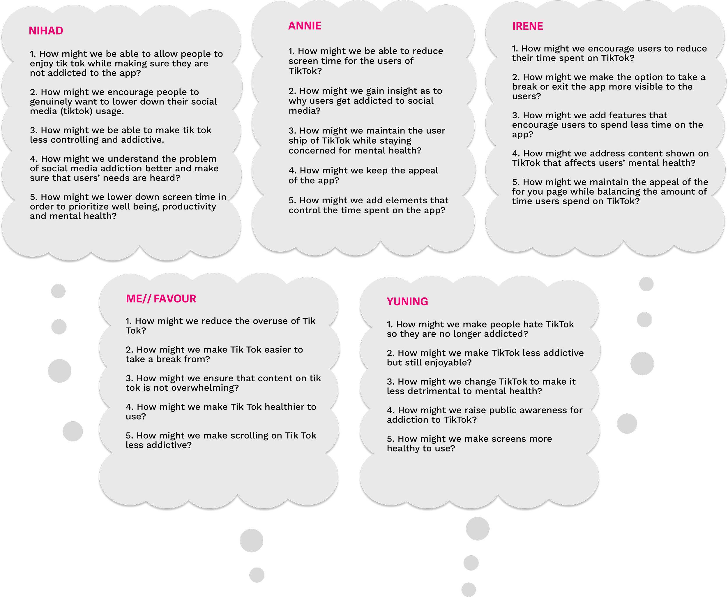
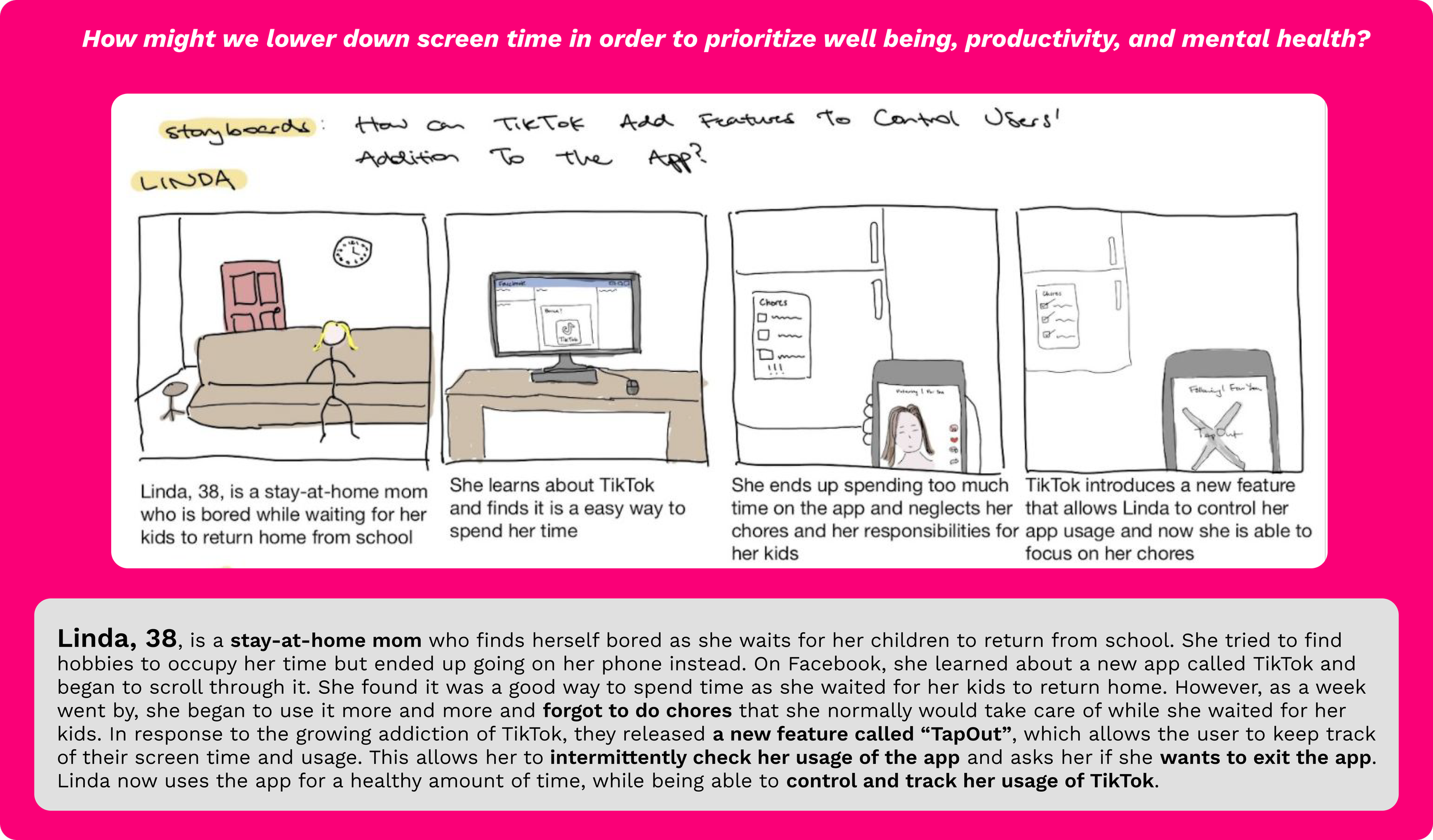
After our synthesis and identifying key takeaways, we began to brainstorm some How might we questions together as a group, in order to further understand how we would possibly mitigate social media addiction, as well as the types of solutions we could ideate.
Then, we each chose one How might we question to focus on from the brainstorming session, and created a user scenario and storyboard to illustrate the ideas.


We gathered our ideas from our user scenarios and created Wireframes of them, implemented into the TikTok App. Taking into account the user’s needs, we wireframed screens that showed pop-up features and scroll bars to keep track of the time-line.


After wireframing our ideas, we prototyped different screens that and interactions that we envisioned would mitigate addiction to Tiktok.

We started with Lo-fi prototypes first, exploring how much space certain elements would take up and their relationships to each other on the screen and to the user. After each creating our various versions of the Lo-fi prototype, we combined all our ideas and layout’s into one Lo-fi prototype.


Now that we had a base lo-fi prototype to build off of, we moved onto creating a mid-fi prototype, to explore how the interface would feel in relation to our interventions.

Before testing our hi-fi prototype, our group decided on the guidelines of how the prototype would operate in reality:


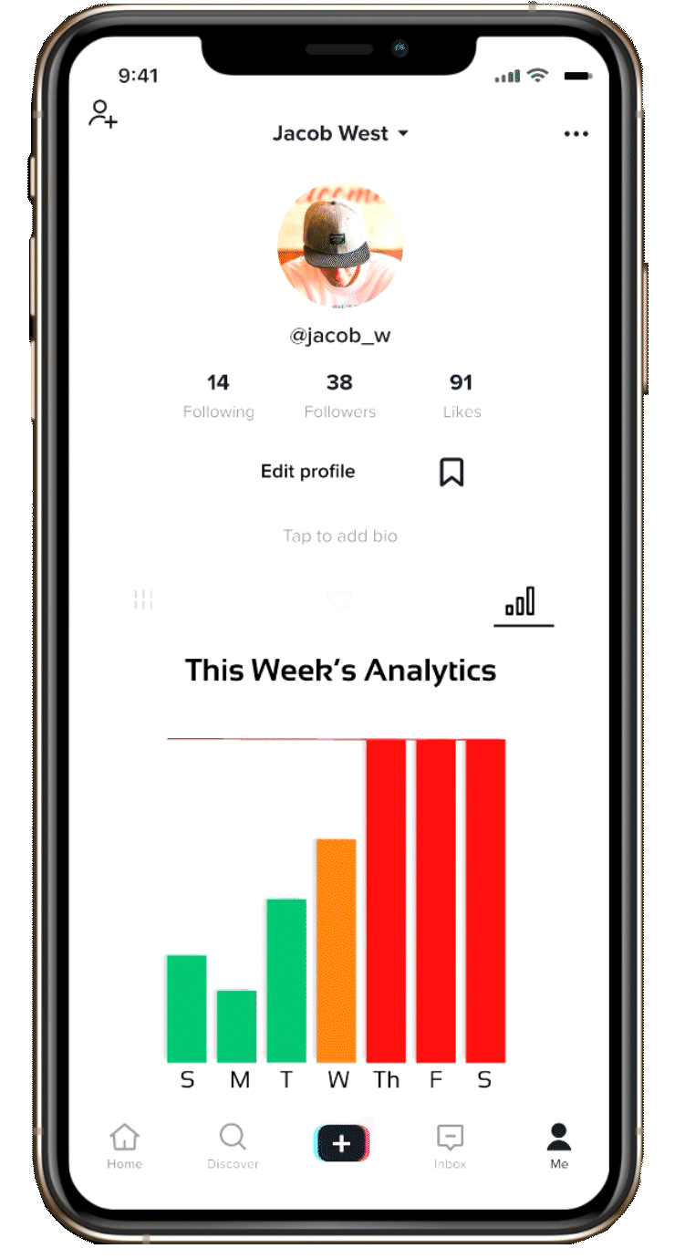
Color of analytics bars:
Green if the user is below limit, Orange if they have mid-usage, Red if they reach their max time.
Notification Reminders:
Pop up screen and notification reminders to break user’s flow of continuously using the app.
Buttons:
Buttons and notifications for feedforward/feedback (exit, “me” page). Buttons disrupt the user’s flow, bright blue color for “exit” button so it stands out.

The screens below show first the analytics page, where the user would monitor weekly app usage, they can click on the red boundary to see what the set time limit is. The second screen shows the pop up notification, with the only option “now” closing the user out of the app. The third screen shows the automatic message the user gets when they have reached the end of the time-line, exiting them out of the app for 2 hours.
Some Final Screens


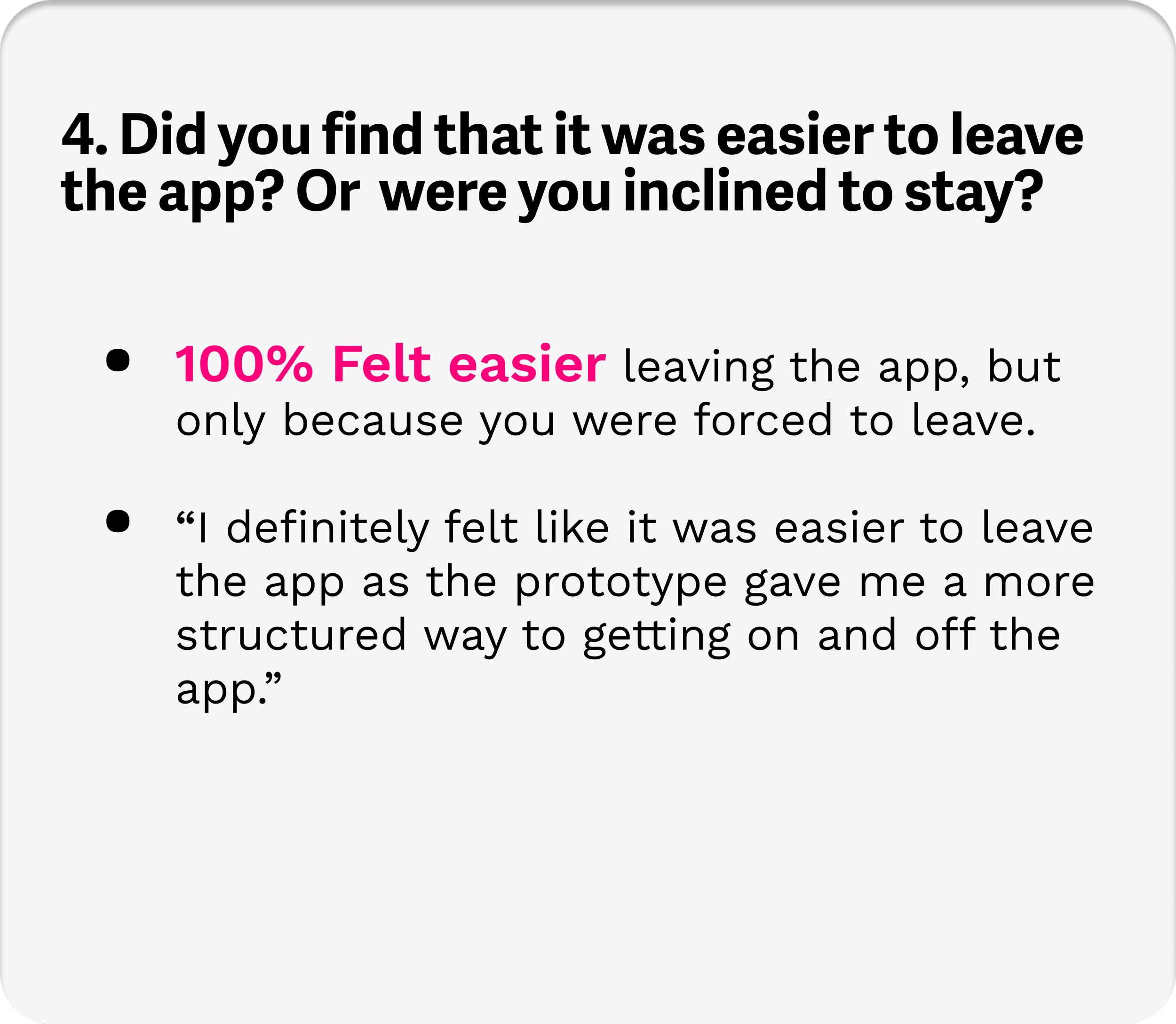
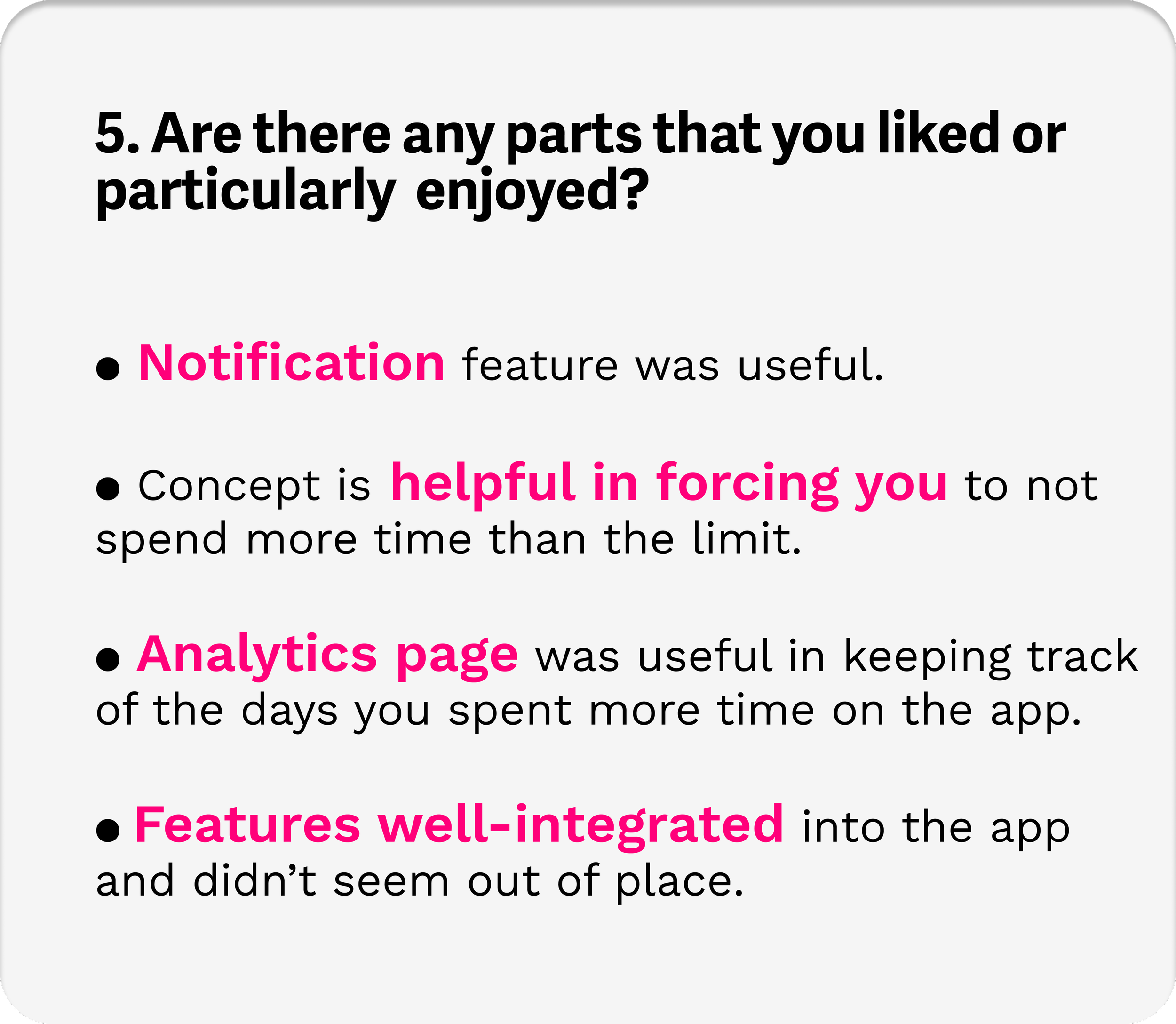
The photos below show us conducting the usability tests in person, before asking follow up questions that would allow us further understand areas where we went wrong and where we went right.

Check out our Findings!


After synthesizing our findings from conducting the usability tests, we brainstormed way in which we could improve our intervention in relation to the feedback we received, as well as our overall goal.
How to Improve in the Future...
We found that users may find it easier to quit the app if we state more clearly and boldly that the timeline had ended.

Users want to see the specifics of the data, we can make the analytics more informative by including daily time usage rather than including only the weekly bars and the time limit.

Some users mentioned that the 15 minute notification was not prominent enough and they didn’t even see it, so we can change the 15 minute notification to take up the whole screen, so that it breaks the users’ attention from the content.

It can be beneficial to introduce an incentive to urge people to get off the app by possibly making a point or reward system which would encourage people to spend less time on the app.

Many users observed that a lot of the aspects of our prototype were forced and with not much choice. In the future, we could offer more freedom in deciding time limits and app usage.
