
Student Dashboard

Project Overview

Problem Statement
Being able to reflect on good quality feedback after a presentation is hard to achieve as students are often reluctant and/or information is hard to consolidate especially with remote learning on the rise, how can we make receiving and monitoring peer feedback easier and more accessible and engaging for both the students and instructor?
How might we make giving feedback an easy and fun process?
How might we represent the data from presentations in a digestible way for our target audience?
How might we make the interface less distracting?

Solution
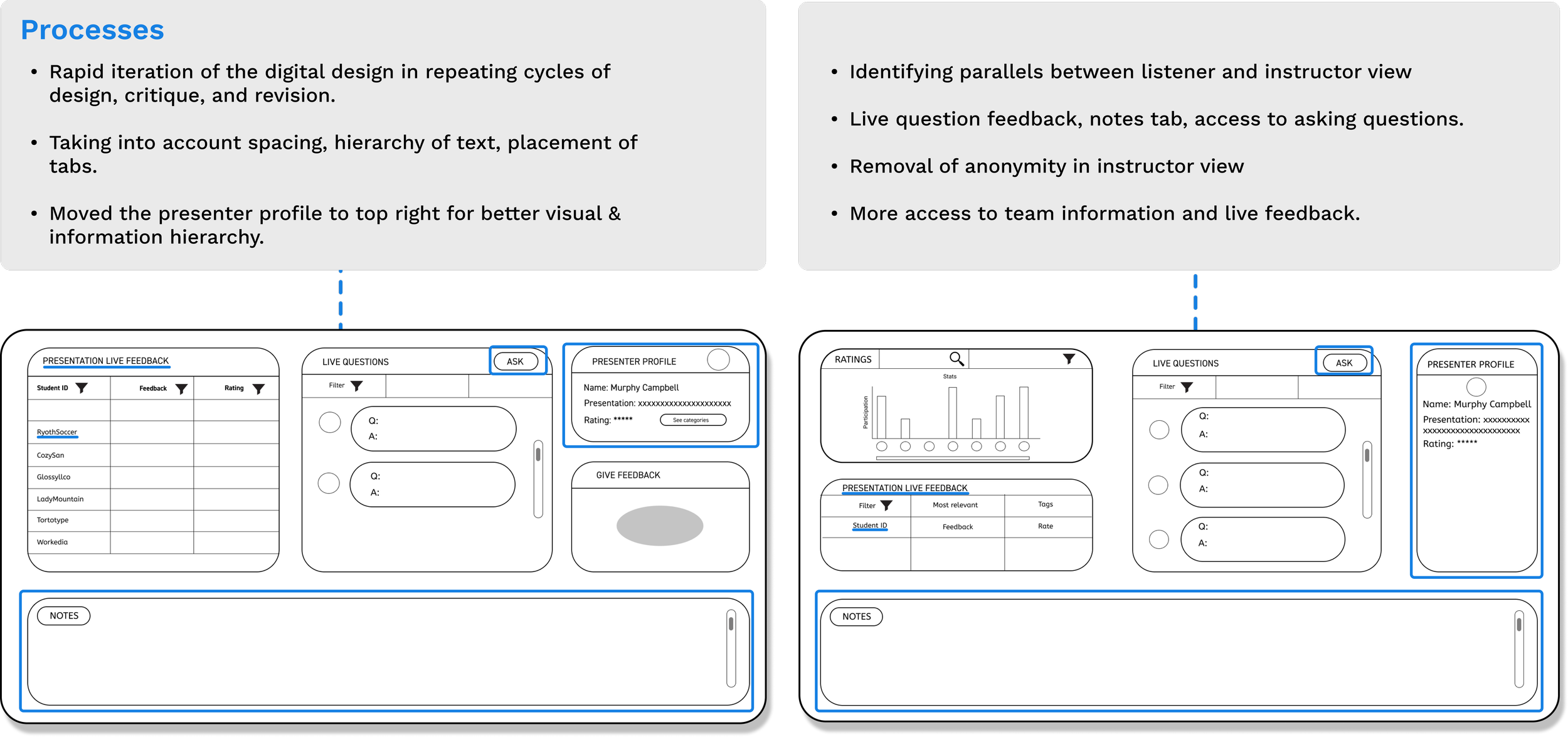
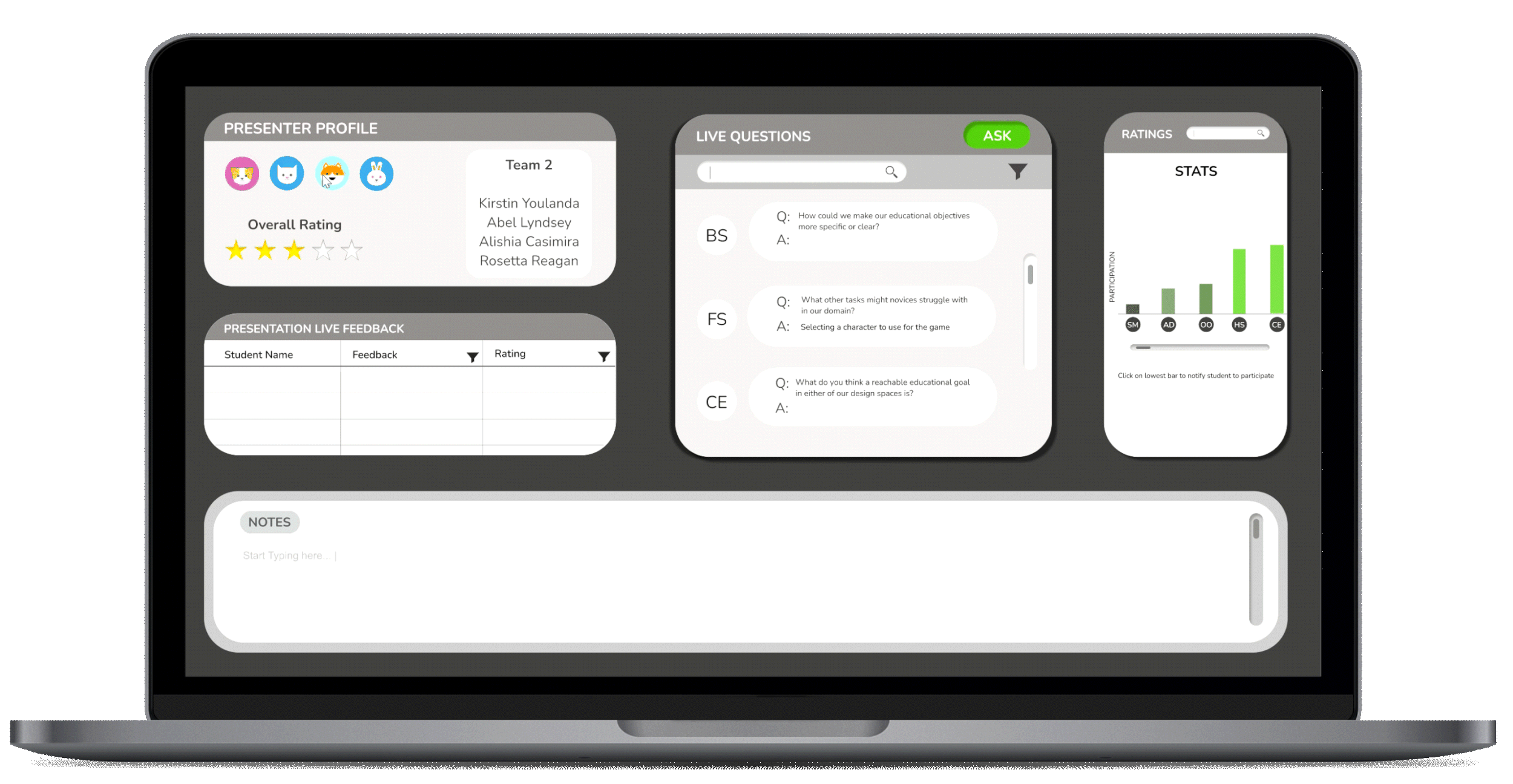
We designed a dashboard with both professor and student layouts. The student layout includes a focus mode which urges student’s to focus and give more feedback, while the teacher layout includes an option to re-arrange the dashboard and notify students to give more feedback. These features address the user needs in an effective way to ensure students are giving and receiving feedback effectively, allowing the teacher to also monitor the feedback effectively.


To understand what we need on each dashboard, we created Empathy Maps to summarize the interests, needs, and goals of each persona. We looked at how each person feels, what they do, their influences, motivations, and pain points.


Needs Analysis
After creating profiles, researching and understanding the user needs, we then created a summarized diagram of how each set of user needs relate to each other.

Data Wrangling
After creating an empathy map and performing a needs analysis, the next step we took was to extract relevant data from a provided database that specifically fit our stakeholders' needs. Basically we had to sieve through the information to figure out what was important to each persona. To do this we first analyzed the data set to see what information each persona needs to see/filter based on their needs.


1// Engaging listeners with Focus Mode
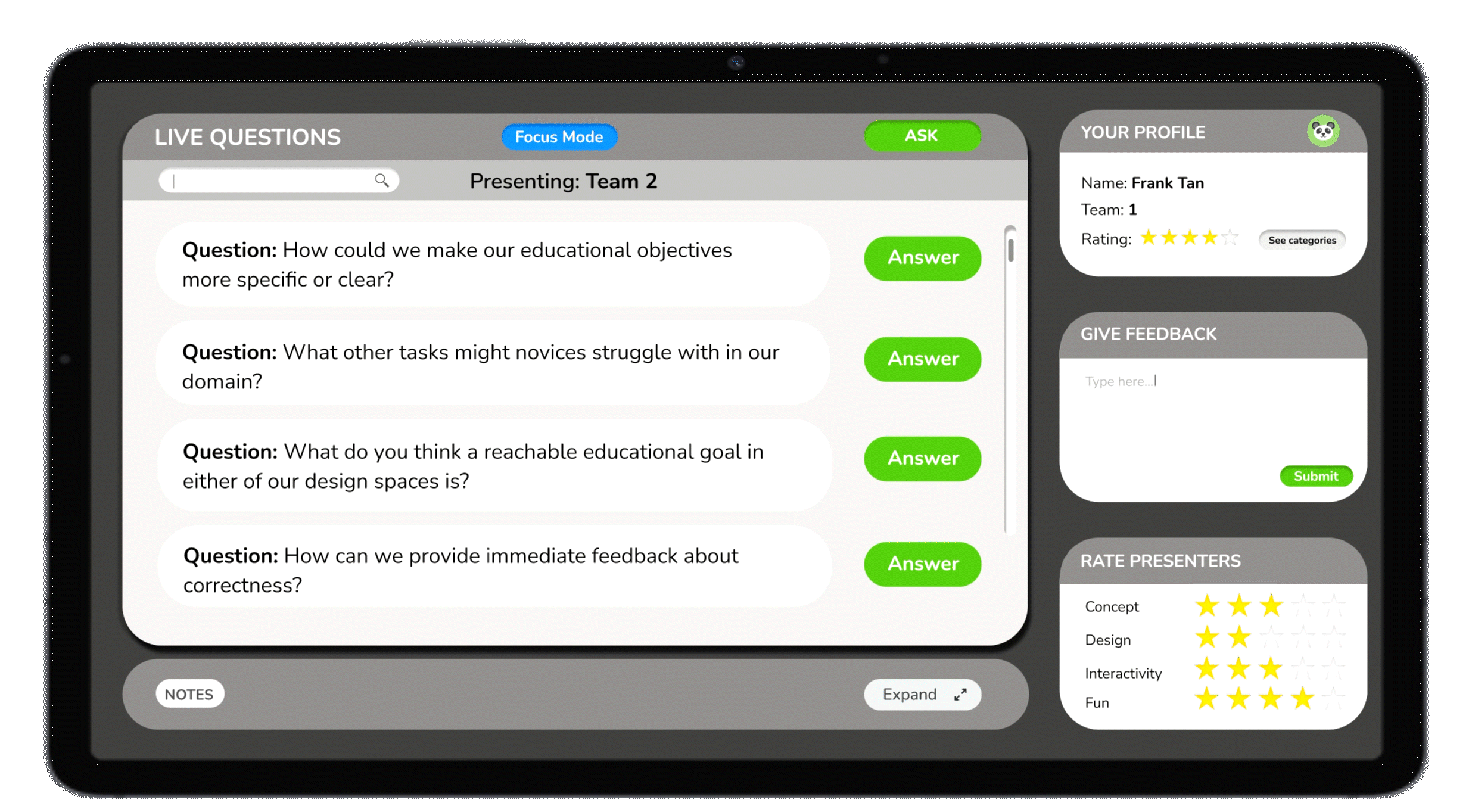
Due to our analysis, we determined a good way to ensure the student presenters receive high qualaity feedback, is to make sure that students stay attentive and engaged during the presentation. Therefore we determined to include a focus mode option where only live questions and feedback tabs will be accesible, so as to urge students to focus.
2// Legible display of information
Due to our analysis, we determined a good way to ensure the student presenters receive high quality feedback, is to make sure that students stay attentive and engaged during the presentation. Therefore we determined to include a focus mode option where only live questions and feedback tabs will be accessible, so as to urge students to focus.
3//The Instructor can urge for feedback
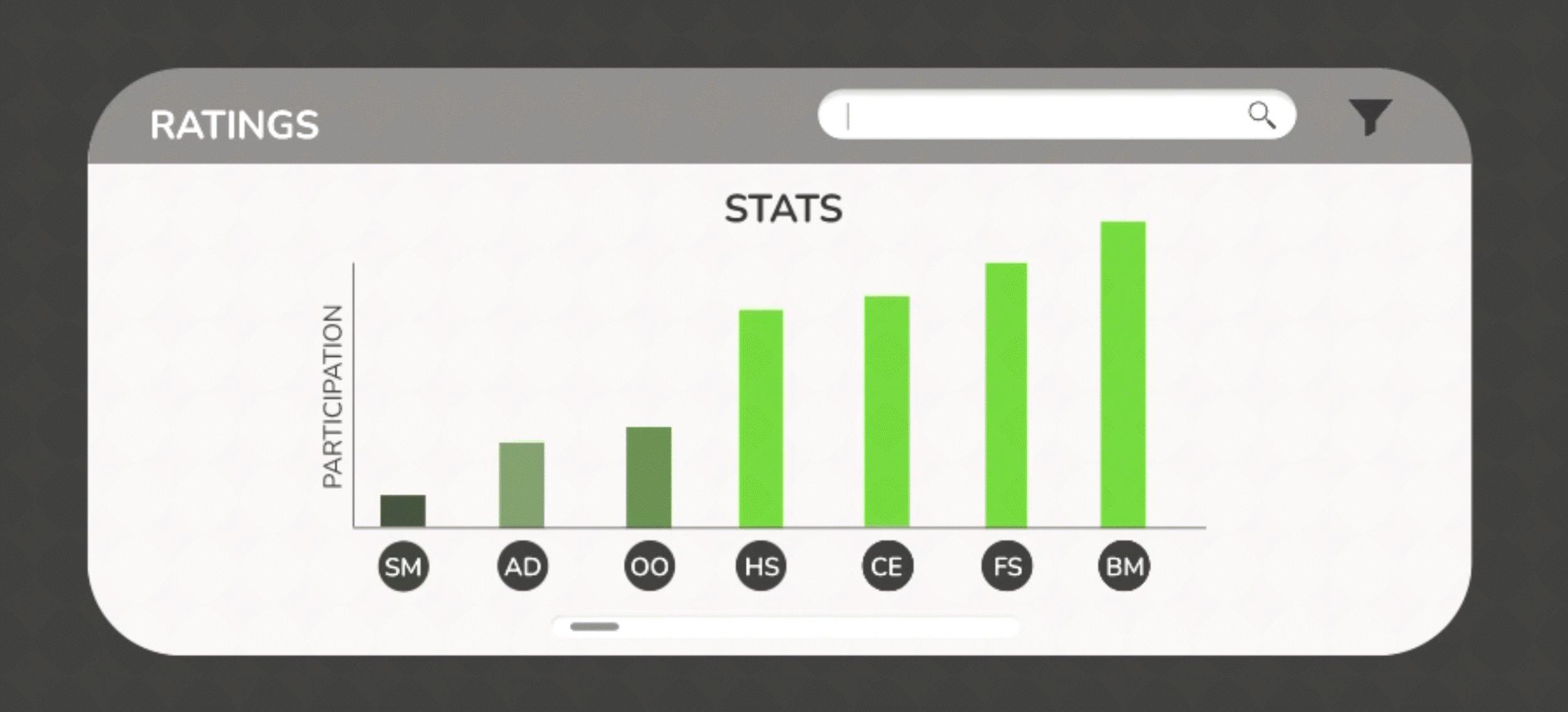
In order to keep students engaged and keep track of their activity, we endeavored to include a data bar graph display showing the activity stats for each student. Having the ability to nudge or notify a student with low participation would also be a good way to monitor and engage the students.
4// Animations can make giving feedback fun!
As one of our goals was to make giving feedback fun, we discussed how animations and moving parts could liven up the experience and keep users interested in using the forum.

Next, with the key insights in mind, we individually created sketches of both presenter and instructor dashboards to explore different directions. We created these with common goals in mind.
1. To provide the professor with a comprehensive view of class.
2. To provide the listener with a clean simple view to give feedback and take notes.

Instructor Final Sketch
From our individual sketches, we combined our ideas to generate a list of key features we wanted to include in the instructor view. We used our needs analysis to select these features.

Listener Final Sketch
Next, we collaboratively created the sketch for the listener view. We carefully analyzed the needs and pain points of the student listener and included the following features.


We received feedback on our layout and created lo-fi digital sketches of what the dashboard contents may look like.
Student Listener View
Instructor View

Student Listener View
Instructor View

As the audience for this UI would be high school students and teachers, we wanted to curate a palette that was clean and simple with slight pops of color.
We chose these greys as they had cool undertones and created great contrast against white, which is important for legibility since users will be reading and writing a lot on the interface. The green and blue shades brighten up the interface and keep the young users more engaged.


After further feedback and iteration, we created another round of sketches taking into account the improvements that were suggested during feedback.

Taking into account user needs, we planned to allow the instructor to notify students to focus, while allowing access to customize dashboard layout via tab placement and size.
After another round of feedback and comments, we revised the colors to improve contrast.
Darkened background and lightened tabs- improved visibility of bar graphs.
Increased saturation of the color green and blue.
Student Initials used for professor view for ease of access.

To engage the student listeners to switch between having focus mode on and off, we added a smooth animation which expands the notes tab and presents more interaction via unanswered questions.
We planned to incorporate a default Focus Mode for student listeners like Frank.
Ability to switch default Mode off for students who can focus with more interaction.
When switched on, the Focus Mode button turns bright blue for contrast and improved visibility.

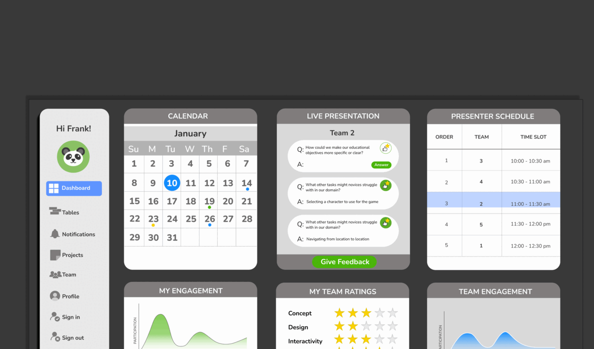
When the Focus mode is on, the display only shows questions being asked and a tab to submit feedback. The brightest buttons are the “answer” “submit” and “focus mode” buttons. This is so that students are drawn to answer questions more often, submit feedback more frequently and leave focus mode on for most of the time.
Listener View: Focus Mode On
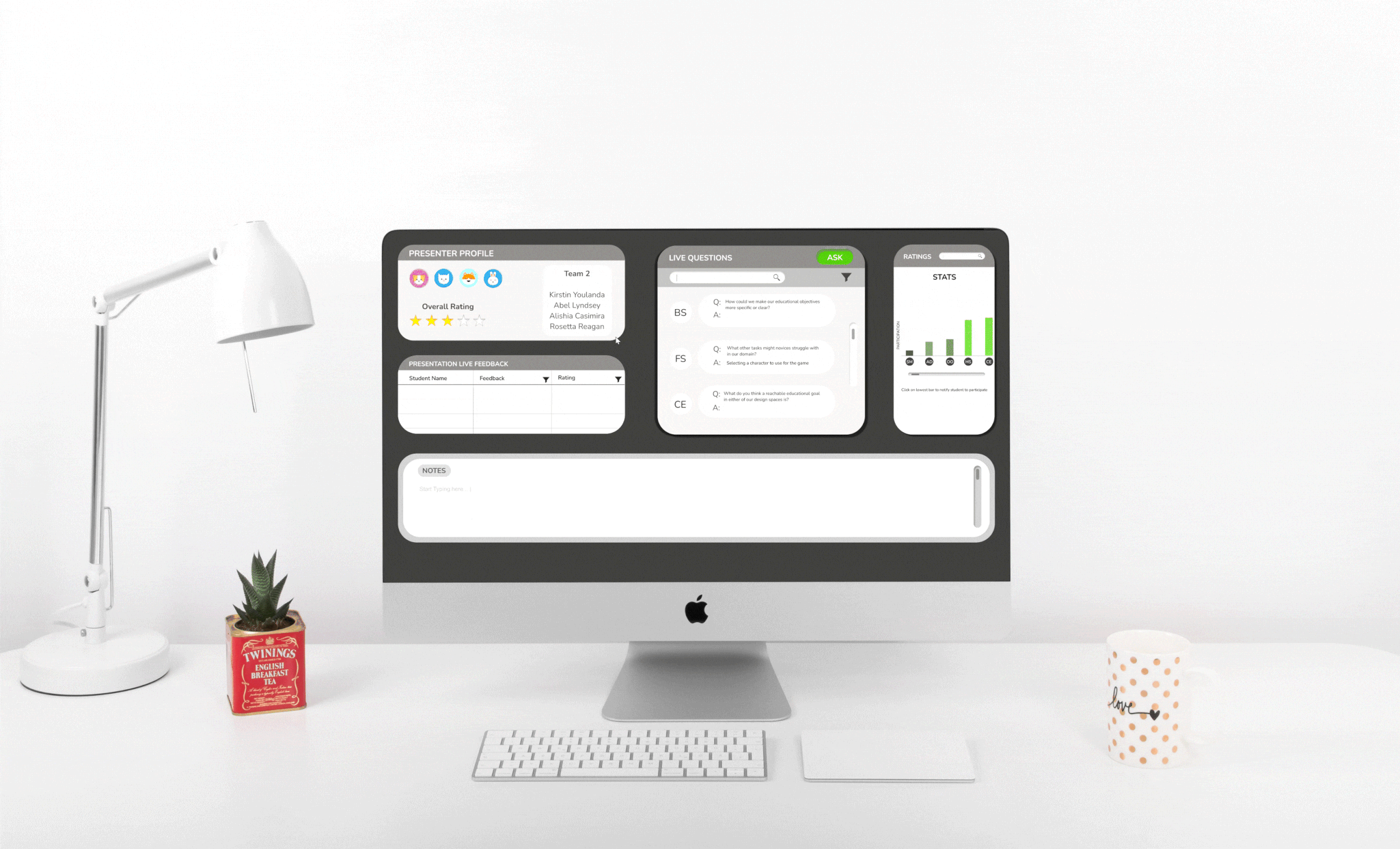
Instructor View
Listener View: Focus Mode Off

Default when dashboard is opened, shown by blue “Focus Mode” button at the top.
Only shows questions from presenter, not other students’ answers.
“Notes” starts collapsed, but can be expanded since that helps some students focus.
Focus Mode On:
Can see other students’ answers + upvote them.
Least answered question on left, so presenters can get more feedback.
Notes can be collapsed here, too. Form of Reveal Animation*
Focus Mode Off:

When a student's participation stat is very low, they will get a notification as such from the instructor. This is a way for the instructor to nudge the students and tis is how it shows up on the student’s screen.

“Stay Engaged”:
Lowest participating students rearrange at the front.
Used Gestalt principles with graph representation*: Lighter green means doing well, other shades are varying degrees of concerning students.
Quality of feedback + number of responses determine participation.
Hover over a student’s initials to see their full name.
Click on name in Ratings graph to notify student to pay attention.
This is displayed on the instructor’s screen: student receives a similar pop-up that their instructor has notified them.

Hover and Notify:
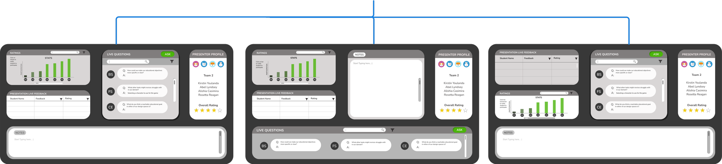
Drag and drop widgets to rearrange instructor’s screen.
Allows flexibility of teacher to view most important stats at a certain time.
User scenario: Alanna wants to takes notes on the changing bar graph, so they want to view both tabs side-by-side.
Note: In practice, any widget can be dropped to any other location. However, due to the limitations of certain tools, our demo only shows each widget swapping places with one other widget.
Drag and Drop!:
Following the design of the screens, we added animations in Figma, by protoyping these interactions, we created demos of how our personas would use the platform to achieve their goals.

After testing our initial prototypes with potential users, we further iterated the prototype and animations, to further take into account the user needs, and enhance the user experience.
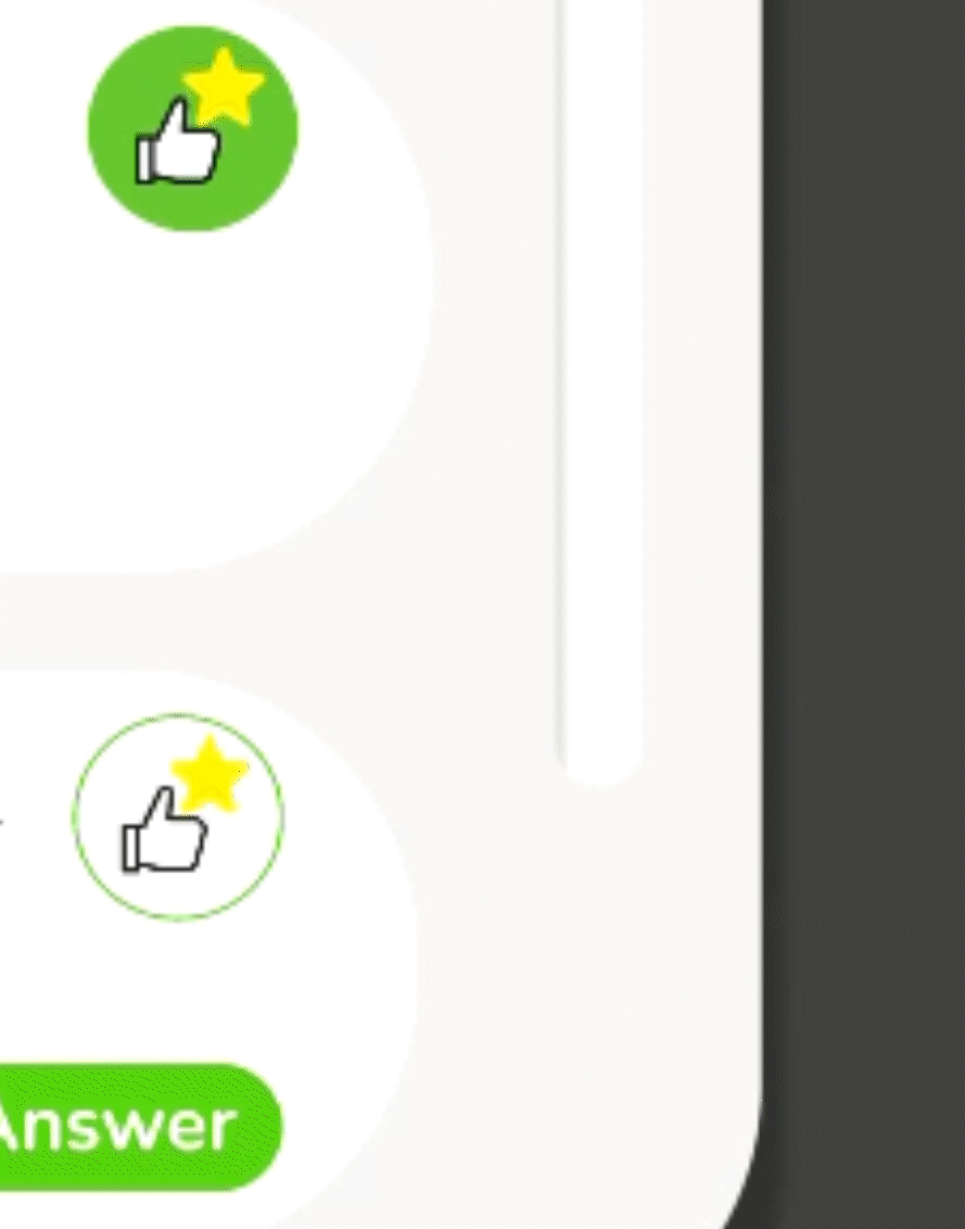
Added an animation over the upvote button.
Animation is short, simple and quick so as not to be be too distracting to the users (users like Frank).
Animation is also engaging for the users and encourages more participation in the form of upvotes.
Helps murphy’s team further understand which answers are most relevant/ useful
Upvote Button :
Added a slow blinking light on Stacey’s name to indicate participation is low and she needs to be notified.
Acts as feed-forward to encourage the instructor to notify Stacey.
Slowed both blinker and focus mode toggling animations.
“Feel” of animations previously felt too high energy, when we want teacher and students to feel settled. Thus, slower animation.
Blinker Speed :


